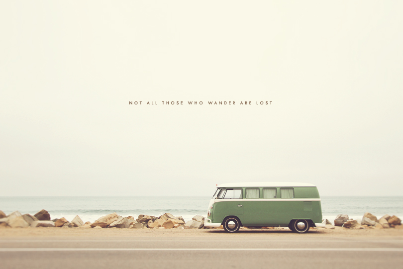
I’m quite a bit obsessed with hippie vans and they’re nowhere to be found in Canada, so my heart was essentially jumping out of my chest every time I came across one of these vans everywhere in California! This one parked along the Pacific Coast Highway was just extremely ripe for a photo :). The perfect print for wanderlusters!
Been back from vacation for a week and am now just getting around to pictures! This last trip was a complete blast. Even though we didn’t venture off too far, it was right up among our favourite trips yet. We must just really, really love road trips.
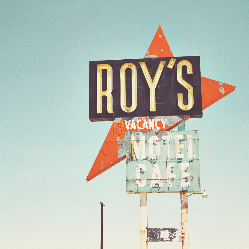
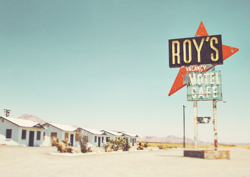
Here’s a shot of the famous and abandoned Roy’s Motel and Cafe on Route 66 in Ghost Town Amboy, CA. It’s stationed in the middle of nowhere in the California desert. Of course my husband and I psyched ourselves out reading up on all the horror stories of Amboy like here, here, and here right before we visited the town. It makes the experience a tad bit more thrilling. ;) We didn’t stay very long though because despite the thrill, there was some very real anxiety. So, we jumped out of the car for a brief moment to snap a few photos and then went on our way!
The photos turned out vibrant, beautiful, and full of that 1950’s feel, which was everything we wanted while driving through parts of Route 66. So for those of you who are fans of the Mother Road, here are brand new prints for you to check out! Many more Route 66 prints to come and many more from Arizona, Utah, and California in the hopper, so hang tight!
Our trip is all booked and we’re leaving on Tuesday, June 21st! Yay!! :) So here’s where we’ve netted out.
We’ll be flying into Phoenix, AZ and road tripping up to Utah to the glorious Zion National Park (oh yeah)!! We’ll stay in Zion for 2 nights and then head to Monument Valley, which straddles Utah and Arizona. I can’t wait to see this place in person — it’ll be so extremely cinematic. We’ll stay in MV for 2 nights and then we do the big drive to Los Angeles, where we stay for 3 nights with cousins. In Los Angeles, we’ll be seeing quite a few things but are particularly excited to go beach hopping — Venice Beach, Santa Monica Pier and Malibu Surfrider Beach are at the top of our list. We’ll also be using one of our LA days as a day trip to San Diego; we haven’t quite figured out what we’re doing in SD but likely join the San Diego County Fair — sounds like a great time! After San Diego, we drive along highway 1 to Santa Barbara where we stay and do more beach time for a couple of nights. :)
Sounds like the perfect trip and I can’t wait to come back with TONS of new pictures! In all honesty, I still have not even gone through the full extent of our Europe pictures from last summer, so I’m behind. But there’s never too many pictures!
NOTE A DELAY IN ORDER PROCESSING TIMES: All orders placed between June 19th and July 2nd will be shipped the week of July 11th.
Sitting here blogging in our cozy home while listening to the sound of the pouring rain outside… is a Sunday I sure love. I can’t believe it’s already June. Half of 2016 has come and gone – time keeps on flying faster and faster. I’m feeling the itch to travel; the past 8 months have been religiously dedicated to the house and travelling has taken a back seat. So lately, my heart longs to plan a trip, even just a smaller one for this year. Here are the 3 we’re deciding between:
OPTION 1: Havana, Cuba — to see this city before it changes forever
OPTION 2: US road trip. Route 1 Pacific Coast Highway drive from San Diego to Santa Barbara, with stops in Los Angeles and Santa Monica — 2 years ago, we drove from San Francisco to Santa Cruz so it’ll be nice to see the southern coast this time.
OPTION 3: Similar to Option 2 but start from Santa Barbara, drive down to Los Angeles, and onto Arizona. The scenery changing from blue oceans to the red desert is just going to be absolutely breathtaking.
I think I’m leaning towards Option 3, just have to get the hubby to buy in. :)
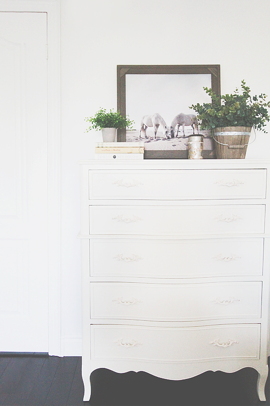
Quick post today! Today’s decor tip is to remember that the top of a dresser is a decor haven that enhances a room, so leverage it! Here’s one recipe to filling the top of a bedroom dresser with pretty things. And of course, there’s nothing that a little greenery, beautiful books, and art prints can’t do. As always, shop the look down below.
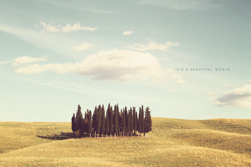
Tuscany is filled with these tall, gorgeous Cypress Trees. There’s almost nothing more breathtaking than Tuscan landscapes. Make it a must-see on your list!
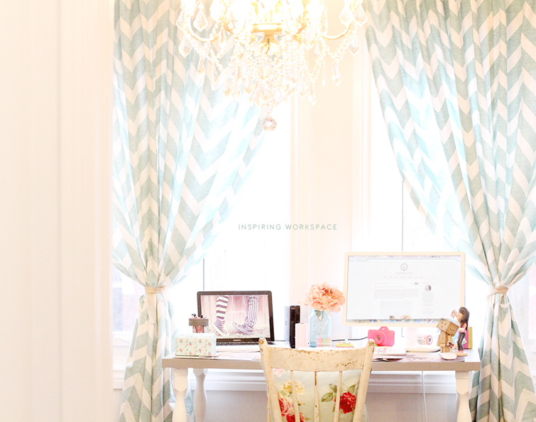
Work can be so much more fun and inspiring if it’s in a beautiful room. Here’s my humble little workspace. It doesn’t take much to pretty up your office! In fact, in our case, this room was high priority in the sense that we wanted to put it together quickly (so I have a place to work) but it was also low priority from a budget standpoint. We had an entire house to furnish, so we held back on office budget. We reused and repurposed a lot of old stuff that we brought from the apartment and still managed to put together an inspiring work desk area. Here’s how!
First, pick a room with good bones and by that I mean WINDOWS! Lots of windows = lots of natural light = naturally beautiful. Then secondly, bring some vibrance with colour and patterns. If there’s one thing I’ve learned it’s that your office is truly the safest place to be bold and adventurous. It doesn’t really have to go with the rest of the house if you don’t want it to. It’s yours and it’s not shared with anyone else. :)
My main focus with this post is DRAPES because drapes are truly magical and change the entire room. If ever a room feels incomplete or not quite there, try drapes. We re-used these patterned ones that were carryovers from the apartment. I like my drapes a little long where they hang loosely on the floor. I also like to hang drapes high, just a few inches (around 3-4″) from the ceiling or from the edge of your crown moulding if you have them. This makes your windows look bigger and the ceilings higher. Don’t make the mistake of hanging them too low; we’ve seen drapes hung just a few inches above the window trim and you’ll quickly learn that you won’t get all its glory that way.
Then think about how you want your drapes to hang. There are a hundred different ways to do this but the most common (and easiest) ones are letting the panels hang straight down, tied to the side, or tied in the middle. In our case, we wanted to tie them right in the middle with burlap ribbon and then we used the drapes to frame up the work desk that now sits in between the tied panels. We made sure these drapes looked hearty, thick, and significant by joining two panels per window. So what you’re seeing in the image is a total of 4 panels, 2 per window tied together. Very important to note that sometimes, 1 panel per window works perfectly, particularly if you’re going for a lighter look with say, sheer linen drapes. Other times, 2 panels work better if the look is supposed to be heartier and heavier. It all depends on the look you’re going for and type of drapes you’re using. :)
The other focus is light fixtures. Light fixtures are also fabulous pieces to anchor a room with. We’ve anchored 3 rooms in this house with chandeliers because they are simply the prettiest things on Earth and add so much character. Not to mention they’re bright like the sun. For this office, we went with a glitzy crystal chandelier with an antique finish. Chandeliers can sometimes cost a fortune but this one was a cheap and cheerful one from Home Depot. It’s not always about buying expensive pieces, it’s about knowing how to put things together! For only $200, this gorgeous chandelier has added just the spark that this office needed.
DECOR TIP: Try exploring drapery and light fixtures when looking to anchor your room decor onto something that then guides the remaining decor pieces that follow.
If you’re looking for ways to spice up a girl’s room, here are some ideas.
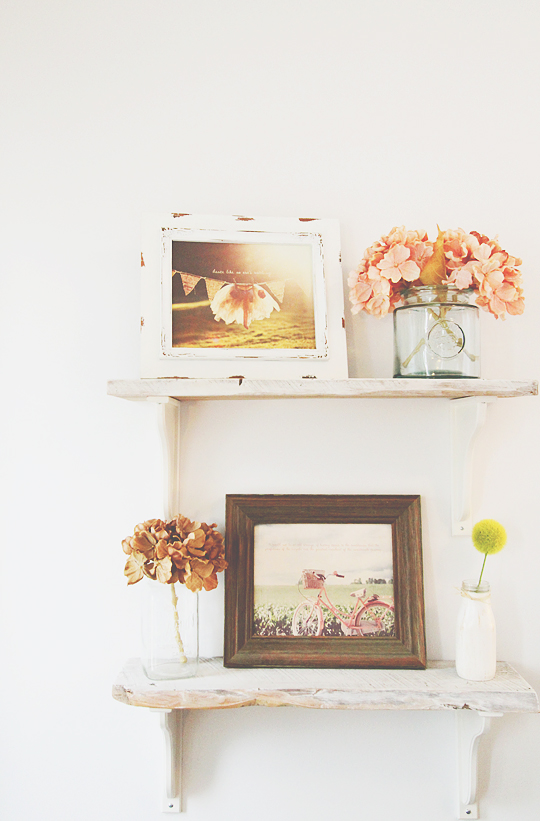
You can do a lot more with walls than just hang the standard art, clocks, and mirrors. You can give it some dimension by installing shelves, inexpensive DIY shelves at that. If you ever venture out to the countryside in the summer, you’ll find wood scraps everywhere. Grab a few good pieces and bring them home with you! These two were wood scraps we found last summer in and around Bobcaygeon – we picked one with live edge and one without for contrast. :) We slapped some Benjamin Moore super white paint on them purposely leaving some parts uncovered, and voila. There was no method to our madness – we’re terrible painters, so if we can do this, you absolutely can! After all, one of the most awesome traits of rustic furniture is that imperfections add to rather than take away from them.
The brackets were IKEA’S Ekby Hensvik. Gotta love IKEA furniture names. If it wasn’t for the fact that we were set out to hammer through this project and get it done in one sitting, I would have sourced cast iron brackets that were painted white like this! It would add significantly more character – highly recommend going down the cast iron route if building something similar to this. We took the easy way out this time and although it isn’t perfect, it still worked out better than expected (thank goodness)!
SHELF BRACKET TIP: There are standard sizes for brackets, so make sure you familiarize yourself with those dimensions before cutting your lumber to make the shelves. It’s almost wise to start with the brackets first and work your way to the shelves as far as shopping / browsing goes. In other words, find the bracket you like, find the available bracket size that you think would work for your space, then move on to cut your lumber accordingly. (This was a lesson learned from another instance, where we cut the lumber first to the size we wanted and could not find the right bracket size to go with it.)
The framed art is our very own Tiny Dancer and Dutch Bicycle prints, accompanied by beautiful frames from Michaels Arts & Crafts. We highly recommend picking up frames from Michaels to go with our prints and remember to remove the glass. :) Our favourite collections are their Savannah and Heritage collections – absolutely stunning and couldn’t be a more perfect match for our prints. Note that Michaels has some kind of a sale every other day, so make sure to check their website for coupons before visiting the store!
Last but not least, we finished this soft look by softening it some more with jars and flowers. And there you have it, one of many ways to brighten up the walls of a girl’s room!
Ekby Hensvik in White – IKEA
Shelves – Free Wood Scraps in the Country
Super White Paint for Shelves – Benjamin Moore
Savannah Barnwood Frame – Michaels Arts & Crafts
Savannah Rustic White Frame – Michaels Arts & Crafts *Featured Art Print: Tiny Dancer – Charlene Precious Co.* *Featured Art Print: Dutch Bicycle – Charlene Precious Co.*
Glass Cookie Jar – Homesense
Vintage Mason Jar – Garage Sale
Painted Milk Bottle – Paint Creek Hill on Etsy (Shop Closed)
Ashland Fabric Flowers (Discontinued) – Michaels Arts & Crafts
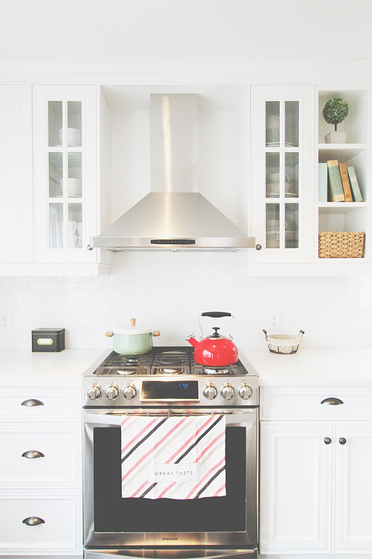
This here is a section of our kitchen and it’s one of my personal favourites. Here are some of my white kitchen ideas:
KITCHEN TIP #1: When all else fails, go white because you can’t go wrong with it. In fact, it’s the surest and safest option in my humble opinion. It’s one of the few “safe” things in life that reap great rewards. It may be safe but it always has impact. A white room is alluring to the eyes. So this one’s about setting a white stage and adding splashes of colour through your finishing touches!
I think a few things make this particular area in the kitchen look dashing. We can start with the big things although they’re not necessarily the things that make your kitchen beautiful. But they matter because they set the foundation – the gas stove (because electric stoves are not quite as pretty), the white cupboards, the glass cupboards, the white brick-style backsplash, and the white countertops all play an important role. But what you do afterwards with finishing touches is what brings it from good to great!
The pot.
The kettle.
The recipe box.
The bread basket.
The china peeping through the glass cupboards.
The kitchen towel.
The books, wicker basket, and plant on the open shelves.
It’s all in the details! Add some clutter in a minimalistic, de-cluttered way. We chose red to be the popping colour and mint green as our secondary, more recessed colour and together, they look fresh!
KITCHEN TIP #2: Bring on the glass cupboards and open shelves! It’s such a nice way to add some character and personality through the items you place on them. Not to mention, it’s incredibly fun to handpick items that are worthy of being “displayed” so to speak!
Now imagine the open shelves did not exist or the glass cupboards in this case were solid wood! It wouldn’t be the same. We do get the hesitation with glass cupboards – you want to be able to simply store not-so-pretty china and dishware without a thought or worry about exposing them to the world. That’s completely valid, which is why you do a mix! A 2:5 glass-to-solid door cupboards ratio worked for us! But when all is said and done, there is no hard and fast rule, just something to consider when working on your cupboards. :)
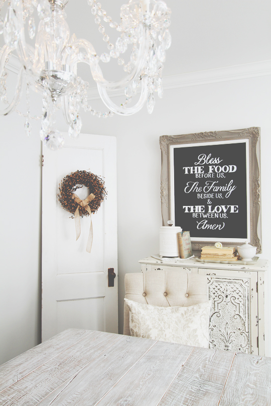
First thing’s first: there’s a lot to talk about in this image but our focus today is going to be on the chalkboard alone! :) We love chalkboards! If it were possible to incorporate a chalkboard into every room without being awkwardly excessive, we totally would. Having said that, a DIY chalkboard decor is suitable for any room and for us, it was the dining room. The best part is you can pretty much make your own to get it just the way you want it.
We started by measuring the space above our dining room “hutch” to determine the acceptable range of sizes for a framed chalkboard. We wanted it to be just a tiny bit smaller than the width of our hutch but not by much.
We headed over to the One of a Kind Antique Mall in Woodstock to find antique paintings in beautiful, old, ornate frames — you can’t find these things anywhere other than the past! We ended up finding two different gold framed paintings from the 1920s that we loved. The frame designs themselves were different but more importantly, the sizes were also different with one smaller than the other. Choosing sizes is always such a dilemma, especially when you’re at the store and don’t have a chance to test in your space.
SIZE DECISION TIP: When in doubt, the rule of thumb is to always go with the bigger one. From our experience so far, this rule applies to lights and wall art at the very least!
We then got Annie Sloan Chalk Paint in French Linen and painted right over the gold frame. The beauty of chalk paint is you can paint over anything even if it has a finish. It’s actually among the best inventions — someone took away the pain of sanding?? We’re in!
After turning the gold frame into grey, we lightly sanded the edges to give it a distressed finish. We also threw some white chalk paint over the yellowing mat that came with the antique painting just to freshen it up and add some contrast!
When the frame was complete, we moved onto the chalkboard itself. This part was really super easy. We got a quarter-inch thick piece of drywall from Home Depot, cut it to the size we needed, and spray painted it with 3 coats of Rust-Oleum’s chalk board paint to make sure we achieved a smooth, consistent surface.
DIY CHALKBOARD PAINTING TIP: We’d highly recommend spray painting on drywall over painting with a brush. You’ll get a much smoother and cleaner surface!
The final step was to hire an amazing chalk artist, that is @edissondesign, to execute the calligraphy on the board. There was no way my husband and I would’ve been able to do this step any justice, so we surrendered to an expert. :)
And there you have it, a DIY chalkboard wall art in the dining room!
Hi, Charlene Precious here! Welcome to my blog that is both a life journal told with words and photographs and an evolving portfolio. I'm thrilled to be able to share my work and my world with you, so thank you for following! (Read more)
Portfolio
View and enjoy a short and
sweet collection of my work right here!